Line Chart
Line Chart instrument is a graphical display tool which brings you Grafana type of monitoring tool inside an ordinary Dashboard instrument pane.
Why not Grafana, then? - OpenCPN is based on wxWidgets cross-platform GUI library. It allows OpenCPN to be available on large number of different platforms. The price to pay is that wxWidgets needs to be extremely conservative on its implementing back-ends. The wxWebView component is needed here and its back-end browser technology is very old. For example, on Windows it is at the level of Internet Explorer 8 or, at best IE11! One cannot run modern web-developments on it but DashT takes a modern line graph library tui.chart, polyfills it, and writes for you software which allowing to use InfluxDB aggregation methods on the data read back from that very same time series database. Resulting function is similar to the to the popular functions provided by Grafana.
Introduction
Let’s take a look at the data we are recording already with InfluxDB Out into the InfluxDB time-series database. The database is not only a bunch of buckets where it collects data but it has also its own set of aggregation functions which can be used to analyze and further filter the raw data and return that data to the sender, such as DashT. Typical use is with off-line analysis which is described below.
NOTE: InfluxDB also sports its own Dashboard layout graphical user interface/application which you are encouraged to study!
In this use case, we are interested in finding rapidly the tendencies in the Speed Through Water (STW), indicating that we are losing the speed. In our instruments our paddle wheel produced data is going unfiltered and jumping up and down so it is no easy to tell anything about tendencies before they become evident even without intstruments…
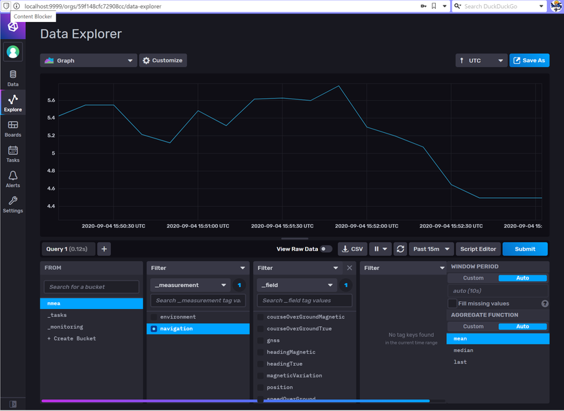
We open InfluxDB and take a look at that data, which in this case InfluxDB shows by default with mean aggregation filter:
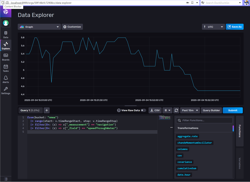
How does the raw data looks like? :Let’s remove the mean filter:
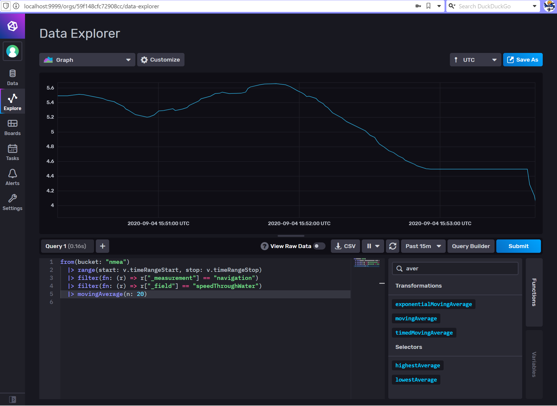
What about applying Moving Average?

Looks much better.
Now, if we could just read that back to the DashT dashboard… No problem!
Setting up
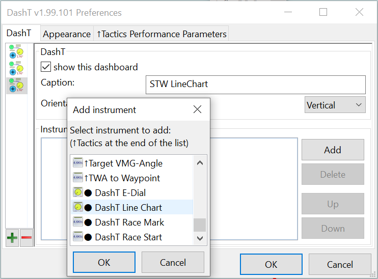
Line Chart instrument is set up like other DashT network augmented instruments, by adding it from the Preferences menu into a Dashboard instrument pane:

Selecting the data source is like with an EngineDJG, by subscription. Only that we do not subscribe to any data which is coming in, but to the data which is sent into the InfluxDB time-series database by InfluxDB Out using HTTP protocol. Only this way one has some data in the database which can be read back.
The instrument is listening, for a while the data which is effectively sent to the database and let you select one of those.
NOTE: The below example works out of box so you are not necessarily required to read the description how it is done. But if you want to make changes it is required for understanding where the settings are coming from.
In order to be able to display something reasonably well, the DashT Line Chart needs still to know about how you want that data being displayed - InfluxDB does not, for example store the units of the values.
DashT Line Chart gets the default values for display formatting from the common configuration file, in this case these are the settings out of the box:
{
    version    : 1,
    path       : 'navigation.speedThroughWater',
    title      : 'STW',
    symbol     : '',
    unit       : 'kn',
    display    : 'chart',
    decimals   : 2,
    minval     : 0,
    loalert    : 0,
    hialert    : 0,
    maxval     : 30,
    multiplier : 1,
    divider    : 1,
    offset     : 0,
    dbfunc     : 'movingAverage(n: 20)',
    dbnum      : 0,
    wrnmsg     : false
},
Compare this to the settings in the InfluxDB Out configuration file, in:
Windows: C:\ProgramData\opencpn\plugins\dashboard_tactics_pi\streamout_http.json
Linux: ~/.opencpnplugins/dashboard_tactics_pi/streamout_http.json
{
    "sentence"    : "OCPN_DBP_STC_STW",
    "mask"        : 4,
    "store"       : true,
    "interval"    : 1,
    "measurement" : "navigation",
    "prop1"       : "",
    "prop2"       : "",
    "prop3"       : "",
    "field1"      : "speedThroughWater",
    "field2"      : "",
    "field3"      : "",
    "skpathe"     : "navigation.speedThroughWater"
},
The database streaming configuration sets up database schema, only addressing the data storage breakdown. In addition it defines - internally to DashT, not in the database - a Signal K data compatible key to make association with the database schema keys. But it does define in any way what is the unit of the data (knots in our case) or how do you want to call it (STW).
NOTE: Signal K In is not required as the data source, it can be also NMEA-0183, it is only that a Signal K data key is used to identify the database schema used to store it.
The DashT Line Chart configuration file is shared with other similar insturments. It is located in these folders, after installation:
Windows:
\Users\Public\DashT\www
Linux:
/usr/share/opencpn/plugins/dashboard_tactics_pi/data/instrujs/www/
It contains instructions how it can be modified and how the instruments are told to take into account your changes.
Here as some interesting configuration values in our use case:
dbfunc : 'movingAverage(n: 20)',
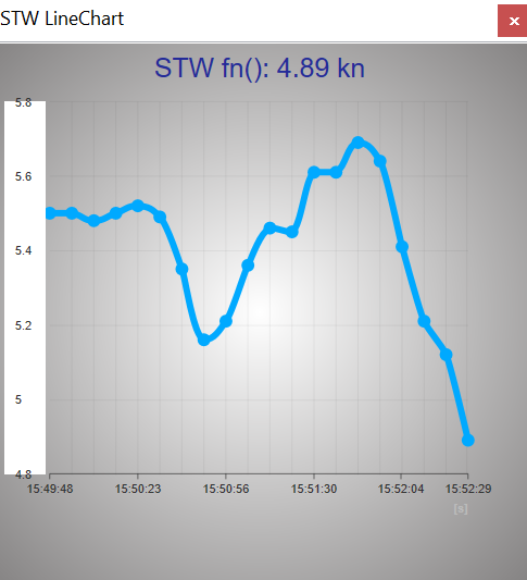
We can add a database function to the inquiry for data base data. In this case the database inquiry is build using the database schema and this string is added to the inquiry, and the resulting datapoints are returned with applied moving average function where n=20 (see the above screenshot from the InfluxDB, it is exactly the same line we add). The presence of a database function is shown with a symbol fn() next to the data title.
decimals : 2,
By default one decimal is used but in this case where we use averaging function, it is better to use two decimals. This way, the line chart is moving to the right direction continuously, otherwise the rounding of the values will make line being stable for a while, then jumping to the next decimal, etc. But if your values are two digit values by default, then one decimal is certainly enough. Please feel free to experiment to find a setting which works best with your data.
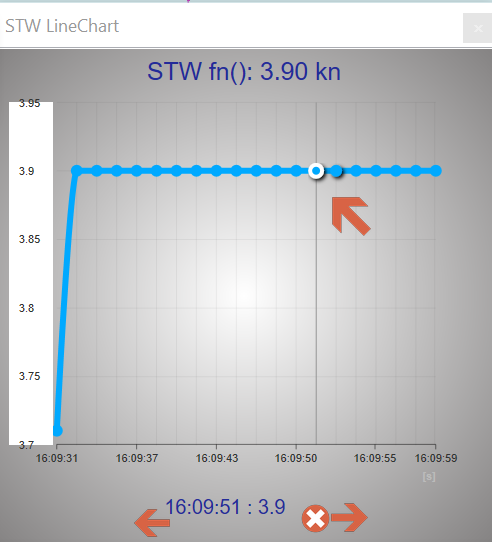
So finally, here’s the result (out of the box):

Pretty cool!
Numerical values
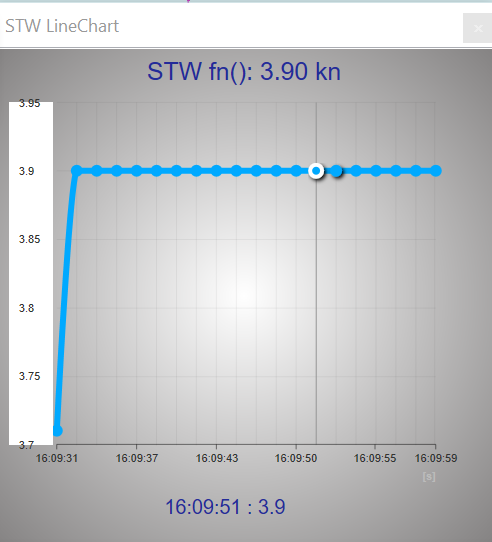
It is possible to read the numerical value of the historical data - the value in the header is the latest received value.
Place the mouse cursor over the bottom part of the graph and move it from left to right. Above the cursor one can observe the numerical value of each data point - in this example they are averaged values returned by the database function.